Wednesday Wheelers
A brand built to keep adventure moving.
Adventure should be accessible to everyone.
Wednesday Wheelers is a community created for wheelchair users who come together on Wednesdays to get outside, explore, and experience the joy of hitting the trail together. When developing their brand, we wanted to create an identity that felt every bit as adventurous, welcoming, and spirited as the group itself.
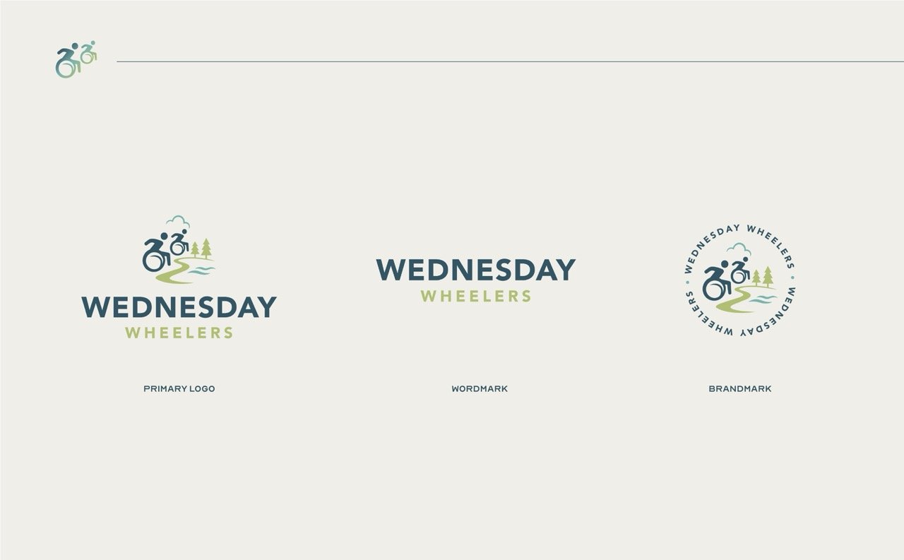
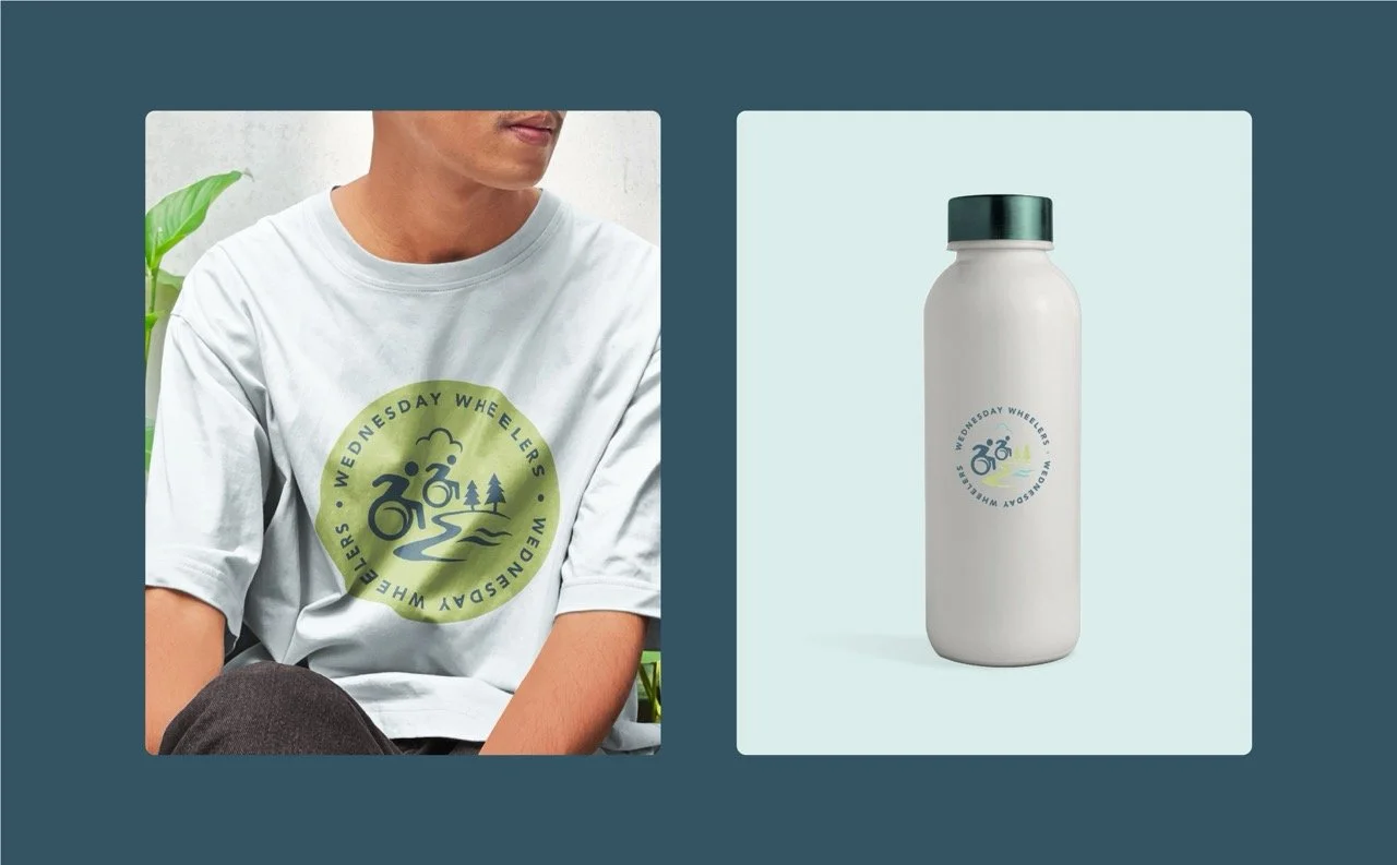
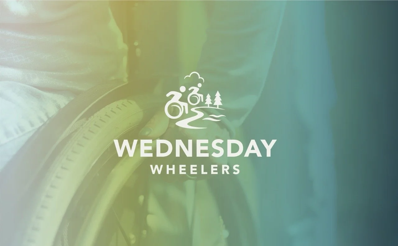
The logo brings movement, nature, and accessibility together in one playful mark. Wheelchair imagery is paired with elements inspired by the landscape—trees, water, open sky, and a winding trail—to tell the Wednesday Wheelers story at a glance. Rather than focusing on limitations, the identity celebrates where the wheels can take you.
We carried that sense of outdoor adventure into the color palette, drawing inspiration from the environments the group explores. Deep Navy grounds the brand, while Lake blue, Grass green, soft Sky, and Cloud neutrals create a palette that feels fresh, optimistic, and unmistakably connected to nature. Clean Avenir typography rounds out the system with an approachable, modern feel that keeps communication clear and accessible.
The result is a brand that feels active without being aggressive, accessible without feeling clinical, and outdoorsy without falling into the expected adventure-brand clichés. Most importantly, it gives Wednesday Wheelers a visual identity built around what the group is really about: community, independence, exploration, and the simple joy of getting outside together.


Accessibility
〰️
Joy
〰️
Care
〰️
Accessibility 〰️ Joy 〰️ Care 〰️