Daisy Chain
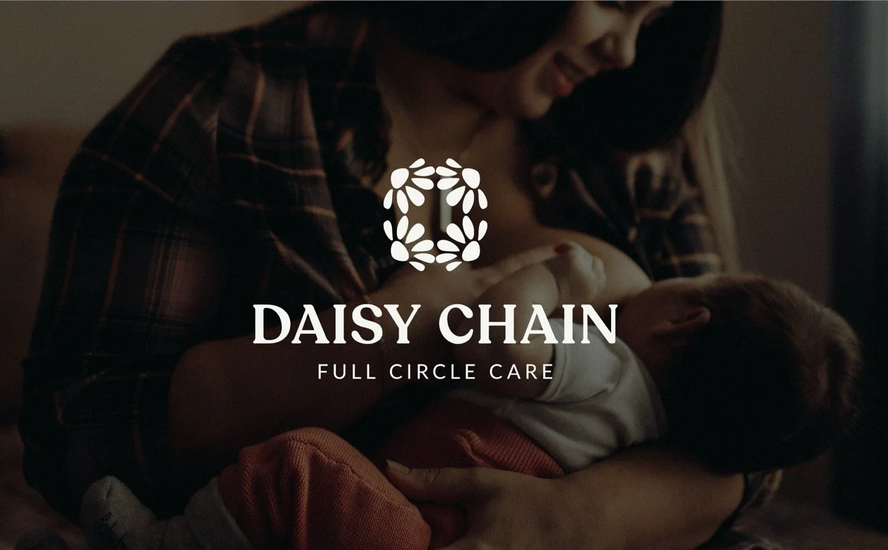
Care, connection, and a brand coming full circle.
For our 2026 pro bono branding project, we partnered with Daisy Chain to refresh their visual identity and create a brand that more fully reflects the warmth, compassion, and community at the heart of their work.
Our goal wasn’t simply to make the brand look different. We wanted to build an identity that felt nurturing and approachable while still giving Daisy Chain the polish, flexibility, and professionalism it needed to grow.
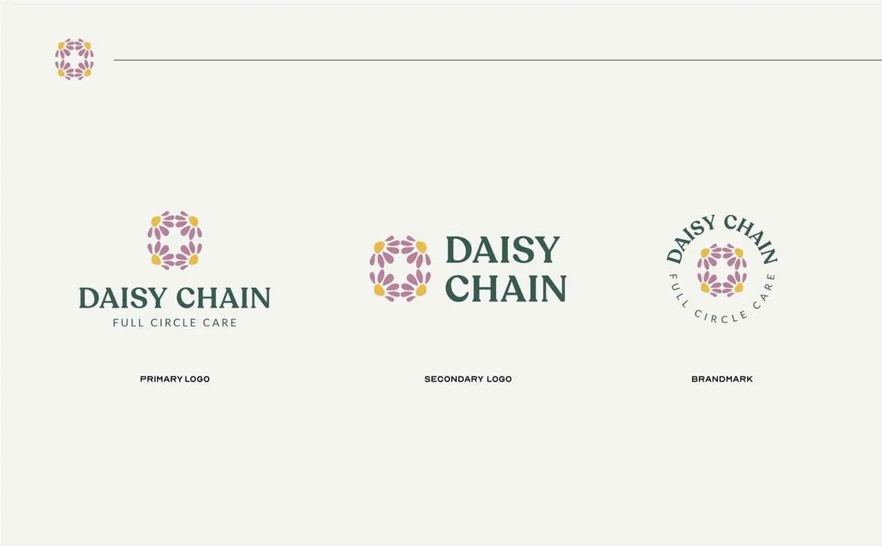
At the center of the refreshed identity is a floral-inspired mark built from repeating organic forms. Arranged in a continuous circle, the elements create a visual representation of connection, support, and Daisy Chain’s “Full Circle Care” message. The system extends beyond the primary logo into horizontal variations, badges, and standalone iconography, giving the organization a flexible toolkit that can grow alongside it.
The color palette takes its cues from nature, pairing grounding Dark Green with warm Marigold, soft Mauve, Light Green, and Cotton. Together, the colors were chosen to communicate healing, joy, and compassion while creating a visual world that feels warm, hopeful, and distinctly Daisy Chain.
Typography brings another layer of personality to the brand. The organic, whimsical character of Recoleta gives headlines warmth and humanity, while the rounded, highly legible Lato creates balance throughout supporting copy and communications. We also considered the practical side of implementation, establishing an alternate typeface for Daisy Chain’s existing website platform so the brand could remain consistent across touchpoints.
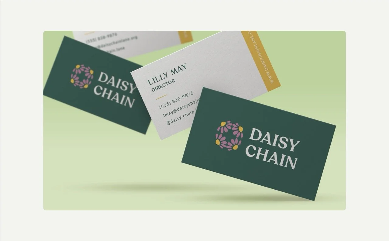
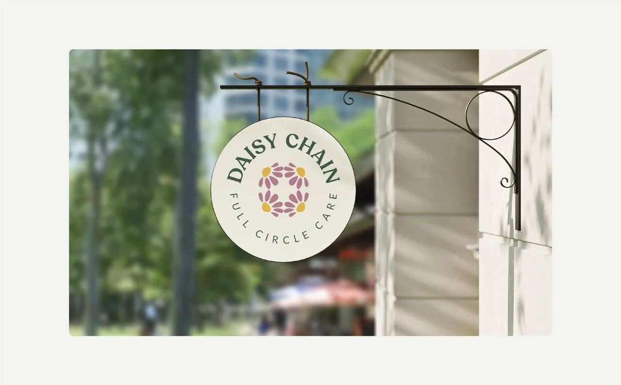
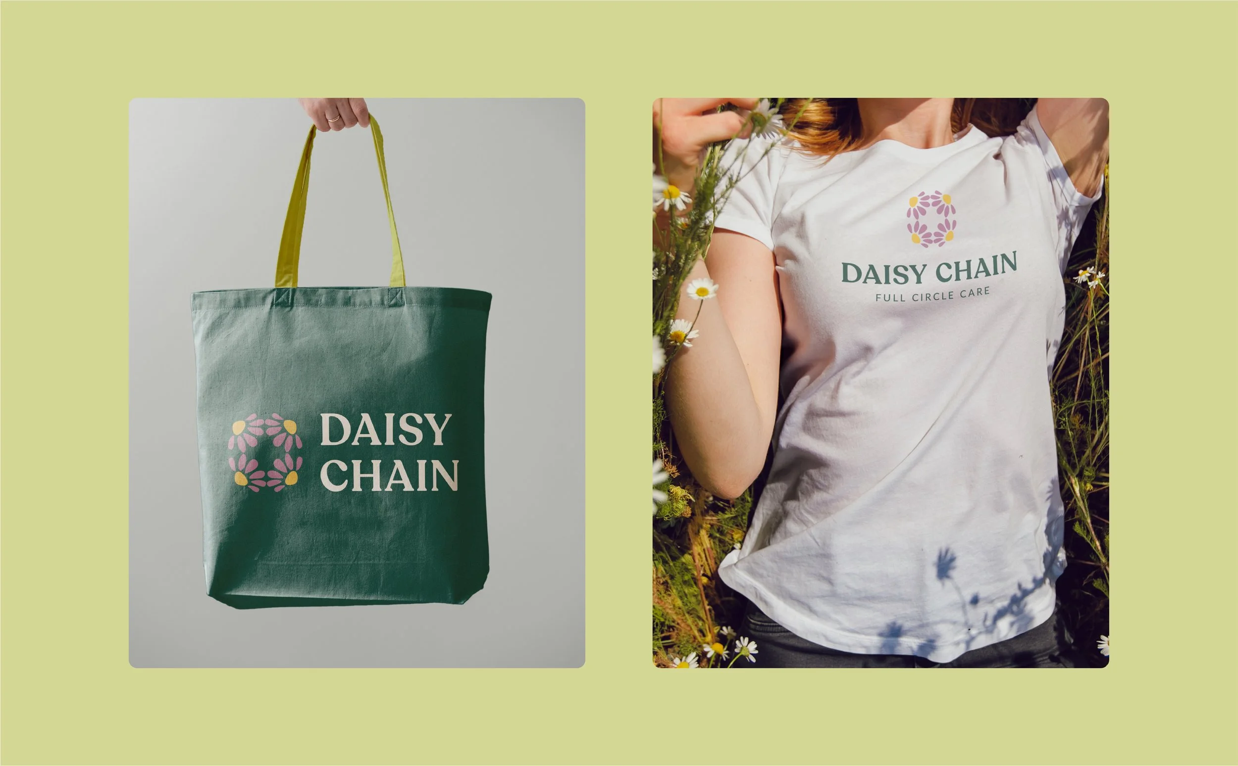
Beyond the logo, color, and typography, we developed a broader visual direction for the organization—from photography guidelines centered around warmth, natural light, empowerment, and inclusion to applications for signage and marketing materials. The result is a cohesive identity designed not just to look beautiful, but to give Daisy Chain a system their team can confidently use every day.
Because great branding should do more than change how an organization looks. It should help the outside finally reflect all the good happening on the inside.


Healing
〰️
Joy
〰️
Care
〰️
Healing 〰️ Joy 〰️ Care 〰️