Design Trends for Non-Profits: Engage Your Audience Effectively

Why Non-Profit Design Needs to Do More in 2025
In today’s digital landscape, mission isn’t enough. Engagement is essential.
Non-profits and charities do great work but need engagement and donors to truly succeed at meeting goals and serving communities.
Every non-profit wants to be seen and wants its message heard across the digital landscape. Non-profits compete for attention just like brands, but often with tighter budgets and higher stakes. Bigger brands benefit from more leeway when it comes to funds to brand and market. However, a brand with effective messaging is key for a non-profit to succeed.
Like with any brand, following best design practices is crucial for designing a non-profit website that converts. Even with tighter margins and higher stakes, effective website design for charities and effective non-profit marketing, in conjunction with strategic visual branding, can elevate any non-profit brand and boost engagement.
To help your non-profit realize its mission, let’s jump into emerging design trends that help non-profits connect emotionally, increase action, and tell their stories more effectively. With insight and expert guidance from Northwest Brand Design, let’s learn how to improve donor engagement with design and benefit from branding tips for non-profit fundraising campaigns.
Interactive Design That Deepens Connection
In today’s crowded digital landscape, an unenthusiastic website often won’t do enough to capture and hold user attention, especially for nonprofits and mission-driven organizations. Website experiences that invite users to participate, like scroll-triggered animations, sliders, and donation impact calculators transform passive browsing into active participation, helping users feel like they are taking part in your success.
Animations
Scroll-triggered animations breathe life into your non-profit’s website by guiding users through stories visually, revealing key information step by step. It’s offering users and potential donors the opportunity to read your story, piquing their curiosity and boosting engagement. Essentially, it’s an invitation for them to get to know you. Similarly, sliders allow users to actively explore how their participation impacts your non-profit’s efforts and mission. And, donation impact calculators reveal exactly what a gift can achieve. Suddenly, a $25 donation is no longer a check, but a palpable experience helping your non-profit achieve its goals. Something so small can make the abstract feel tangible.
Storytelling
Interactive storytelling tools, like maps, timelines, or real-time campaign progress bars, help users follow the journey of your non-profit. Like with animations, it’s a chance for users to read your story and see your growth in a way that’s inviting. Maps likewise show real impact, highlighting communities that your non-profit may have helped. Maps also make your work feel like it’s part of any potential donor’s home because they can see exactly how your mission-driven organization is inciting real change. Real-time progress updates on campaigns and goals add an element of excitement to your website, while also boosting exigency.
The benefits of these features of interactive design go beyond just aesthetics. When potential donors or even loyal donors feel involved in your website, it keeps users engaged longer, increases donations, and builds emotional investment. And, meeting all three of these factors typically leads to continued donations and even sparks volunteer interest.
Invite users to become part of your non-profit’s story by providing them with interactive tools on your website. When users feel welcomed, they’re likely to support you on your journey.
Want help planning a more interactive donor journey?
Donor-Friendly Interfaces and Accessibility

A well-designed, donor friendly, accessible nonprofit website helps users act quickly and confidently to support your organization’s mission, however you need. A simplified, easy-to-navigate, and accessible website, with clear CTAs and secure donations can quickly help your non-profit achieve its goals.
Simplified navigation and mobile-first design ensure visitors to your website (often on their phone these days) can easily find what they need. Fast, clear user paths involve clear menus, intuitive navigation, and fast load times, which is especially crucial for users accessing your site on their phone.
Every click on your non-profit’s website should have a purpose and that purpose should be explicitly stated. Strong and clear CTAs like “Donate,” “Join Us,” or “Attend an Event/Fundraiser” should be consistently visible and guide action. Use buttons that stand out visually and appear at strategic, logical, and intuitive moments in the user journey like when presenting your current need. If you have an upcoming fundraiser and post about a call for volunteers, include a CTA that says “Volunteer Here!” right after.
Make it easy for people to say “yes”.
Accessibility is another essential pillar, one that cannot be ignored or overlooked. WCAG-compliant design includes thoughtful color contrast, easily readable font sizes, and descriptive alt text for images. It ensures that people of all abilities can engage with your content, and, equally as important, signals that your organization is welcoming to everyone.
When it comes to donations, the process should be secure and intuitive, with plenty of options for visitors to donate. Offer multiple giving options—including one-time and recurring gifts, and PayPal or Apple Pay. These options help visitors make a donation swiftly, while trusting their donation reaches you. Your story sparked a donation, so you want donors to feel safe and trusting when they click “Donate Now.”
Bold Visuals and Purpose-Driven Storytelling
While your story and mission are key to your non-profit, your organization’s visual identity is the first impression you make and it should speak volumes. Using large typography, emotional photography, and vibrant color palettes can instantly communicate your values and draw people into your mission.
Bold, intentional typography not only grabs attention, but it also emphasizes key messages (what you aim to accomplish, for example) and helps users absorb content quickly.
Emotional photography that captures real people, real moments, and is full of pathos, speaks a visual language that feels authentic and human. These images tell stories at a glance, whether it’s a child in a classroom, a volunteer in action, or a powerful moment of impact.
Colors aren’t just pretty—they tell your story. Vibrant, mission-aligned color palettes add another layer of connection to your audience and donors. Choose colors that reflect your nonprofit’s personality and purpose. Warm colors (red, orange, yellow) evoke energy, passion, excitement, and urgency, while cool colors (blue, green, purple) create a sense of trust, calmness, and stability.
Motion graphics and video content for storytelling should be integrated into your website, especially on social media or landing pages. A short video on your homepage can showcase your work on the ground, highlight testimonials, or even provide a human welcome to any visitors to your site. Another benefit is, this type of graphics and video content keep users engaged longer.
In the end, these design elements work collaboratively to reflect what your organization stands for and its values: authenticity, inclusivity, urgency.
Strategic Brand Consistency Across Channels
Strategic brand design helps to keep your brand aligned with who you are.
With branding, consistency isn’t just about your “look,” it’s about trust, recognition, and professionalism. Using consistent colors, fonts, logos, and messaging across all platforms and mediums helps your organization feel reliable. Whether someone is seeing a social media post or a newsletter header, they should immediately recognize anything from your non-profit as you. Your content—email headers, social graphics, fundraising campaigns—should all look cohesive.
When branding elements are not always the same, (meaning there are different colors, changing fonts, or updated and outdated logos existing together,) you create confusion. When everything is aligned, however, you reinforce your identity, build confidence and recognition, and let your audience know you are professional and trustworthy.
💡 Pro tip from Northwest Brand Design
Brand guides and Canva templates mean visual clarity without constant redesigns. These two pro tips will help you to streamline the process by avoiding any time spent wasting time, especially for non-profits that are already often strapped when it comes to resources.
A brand guide ensures consistency across all platforms by providing you and your team with a blueprint for your brand. Canva templates also help by ensuring that anyone on your team, regardless of design experience, can create branded materials that maintain your identity and keep your non-profit professional and trustworthy.

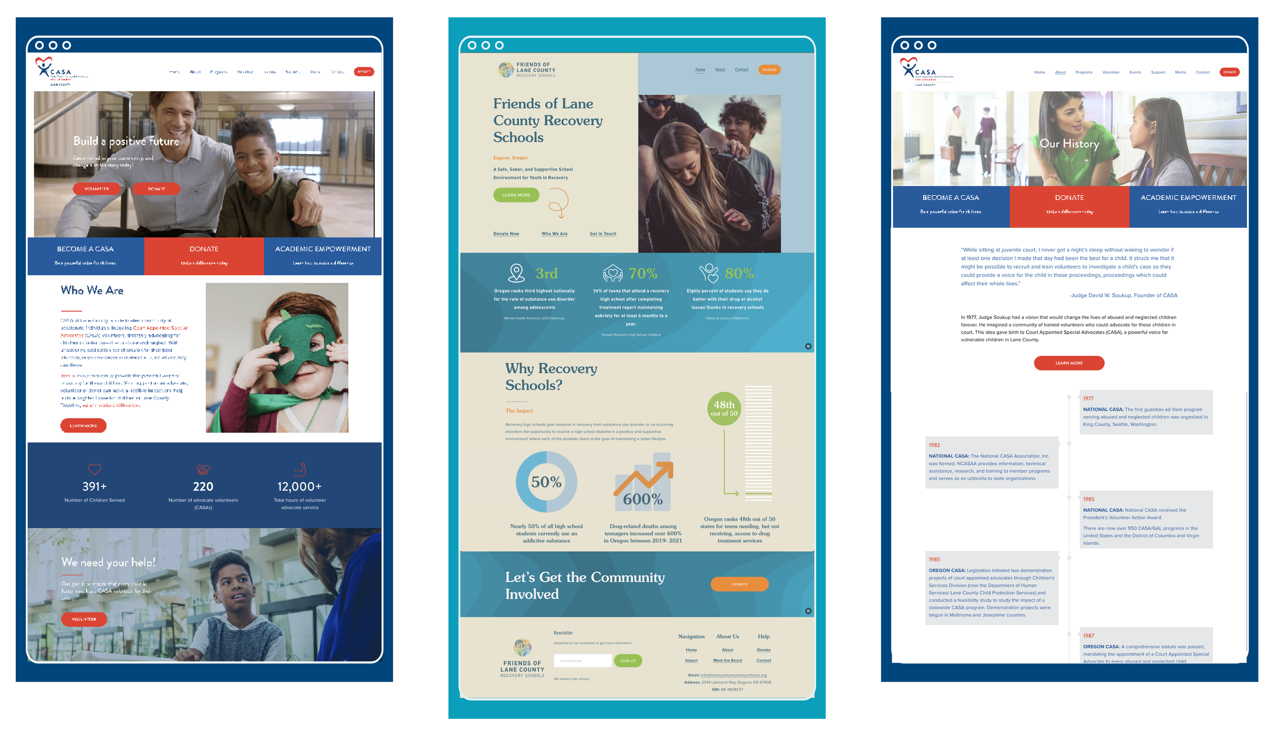
How We Support Non-Profits With Design That Performs
At Northwest Brand Design, we specialize in strategic branding and visual systems for impact-driven organizations. Our approach is collaborative, values-based, and designed for results whether that’s more donations, awareness, or volunteer sign-ups. We work with you to make sure your story is told in a way that is authentic and true to you, while helping you continue to succeed at getting donations and realizing your mission.
These design trends for non-profits should open your eyes to how you can elevate all aspects of your non-profit’s brand. But, why not work with us?